Vahe and Rebecca’s Logo Design
Our dear friends Vahe and Rebecca were getting married and wanted to create a custom invitation and website dedicated to their wedding, neither of which would exist without the first step of the design process that would set the tone for the look of these elements, the logo. They had an idea about the general theme and style of the wedding which would be sophisticated, elegant, and modern with a touch of purple for color.
The logo design that we came up with connects the first letters of their names, V and R, with a custom designed font, and illustrates the elegant aspect of the wedding with its flourishes and dim purple tone. We then took the logo and incorporated it into the website, featured in detail in website design, and the elaborate 5-page invitation which is featured in print.
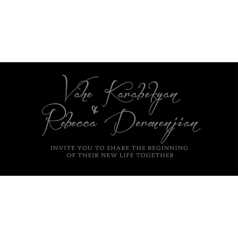
Vahe and Rebecca’s Wedding Invitation
Vahe and Rebecca’s Logo Design
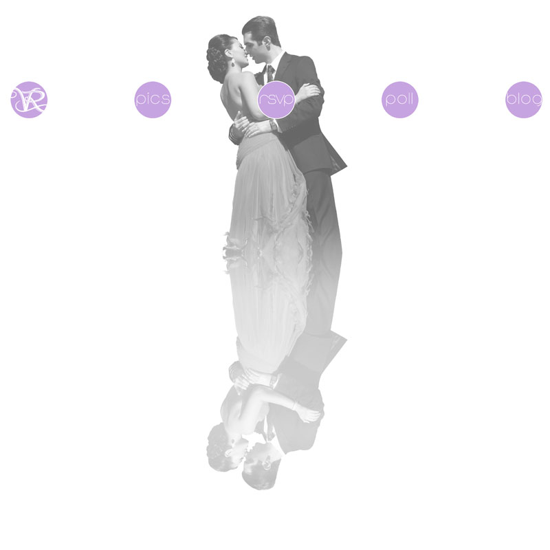
VaheandRebecca.com Wedding Website Design
The wedding website design and layout for Vahe and Rebecca's big day featur...
